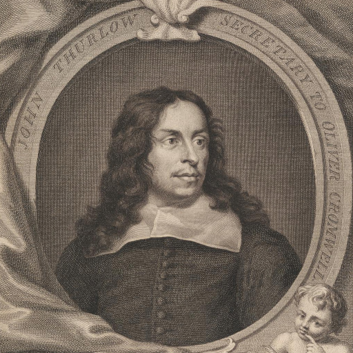
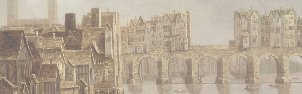
How do you go from your lovingly crafted historical text to a cover? The first step is to decide what will both hook your reader in and tell them what sort of book yours is. For a historical novel the dress and/or weaponry may do both. If it’s a romance we usually see two figures. If it’s the story of a single central character, perhaps putting them on the cover is a good idea, but, unless they are a warrior, or, perhaps, a seductress, conveying their character in an image is not an easy task. As I noted last time, many established authors go for a more abstract image, presumably relying on the author’s name in a big bold typeface to sell the book. My preference is for a picture that evokes the era without giving much clue as to the story.
Of course, as a general rule, the image is only background to the text on the cover. The title should be the main way of interesting the reader. You hope to draw them in and give them some idea of genre at the same time. I use an old-looking font in a script style for the title, again to give the sense of a past era. The author’s name may be the highlight of the cover, but not for most of us aspirants to the title of ‘Writer’.
What else to put on the cover? Like many, I use a subtitle or ‘tagline’. Others will use review quotes, which may be from a posh Sunday Supplement, or from your local writer’s group—some may be entirely made up by the author (‘surely not’, do I hear you say?).
Whatever you put on the cover, do make sure that the image does not obliterate the text, either on the front cover or the spine. Don’t forget that this will be the first glimpse of your work for most potential readers and they need to be able to read it easily and to remember it.
Leave a Reply